Thropic Games Product Design Intern
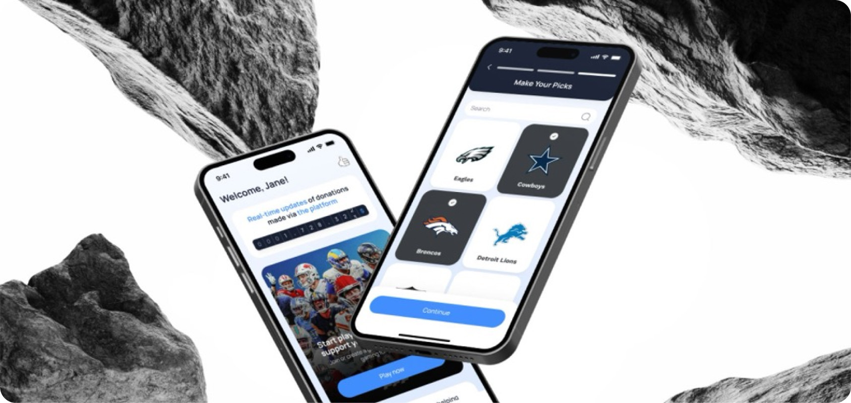
A startup that needed to look like one
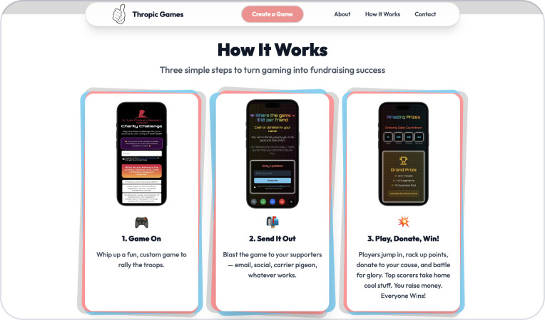
Thropic Games turns gaming into fundraising for nonprofits. The mission was easy to explain, the brand was not. Everything looked a little different depending on where you found it. I spent the summer creating a more cohesive design strategy.
My Role
What I actually made
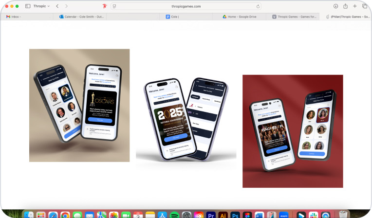
As the design intern at a start-up, I was able to work on nearly all aspects of messaging, including six email campaigns, static ads for three paid channels, a site layout redesign, and even the team’s investor pitch deck. It wasn’t one big project, but rather a lot of small ones that all delivered a united message.
The Brief
Four things were getting in the way
Before making anything, I wanted to know what was actually broken.
01
Alignment
The messaging drifted between channels. Nothing built on anything else.
02
Storytelling
There wasn’t much of a visual story, so nothing held a reader’s attention.
03
Time
Startup deadlines left almost no room between an idea and shipping it.
04
Assets
The asset library was thin, so I kept rebuilding the same things.
Brand Identity
Delivering a cohesive design strategy
The first thing to figure out was what Thropic should look like. I defined a type treatment that stayed consistent, layouts I could repeat, and a visual style that fit the mission. Once that system was set, we were able to streamline execution at a larger scale.

Brand guidelines I created
Thropic Games
gaming for good
- Keep it clear: give the mark room to breathe.
- Keep it clean: no stretching, skewing, or shadows.
- Keep it consistent: approved versions only.
- Mission
- Logo
- Colour
- Typography
- Digital
Brand Colours.
Bright, gamelike, and built for clarity across digital spaces.
Typography:
Outfit
AaBb
Light · Regular · Medium · SemiBold · Bold
Email Design
Templates that made it to GCX
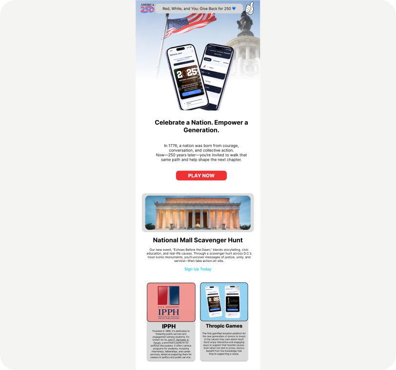
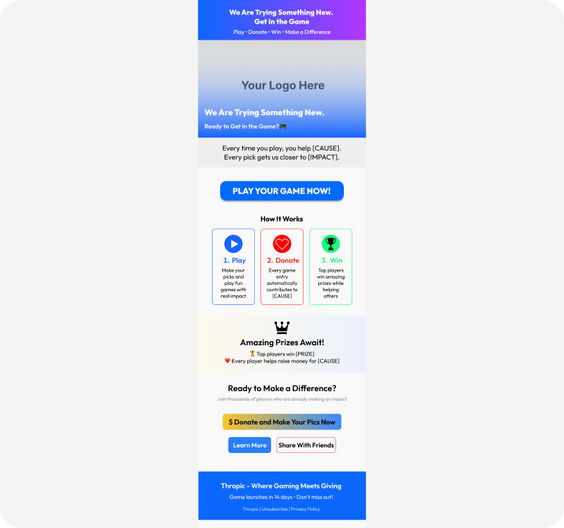
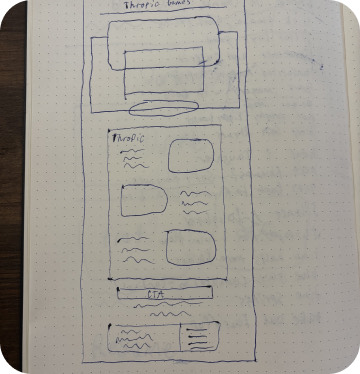
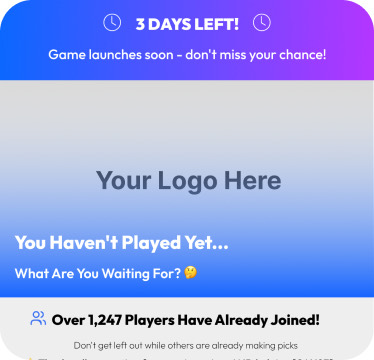
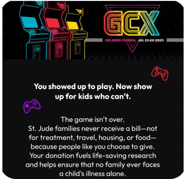
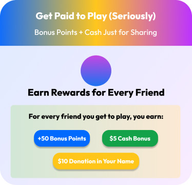
Six email campaigns. I built them as wireframes first, then turned them into templates the team could reuse. Two were featured at Twitch’s GCX convention, which was the first time I saw my work show up outside the company.
Investor Deck
Telling the story to the people funding it
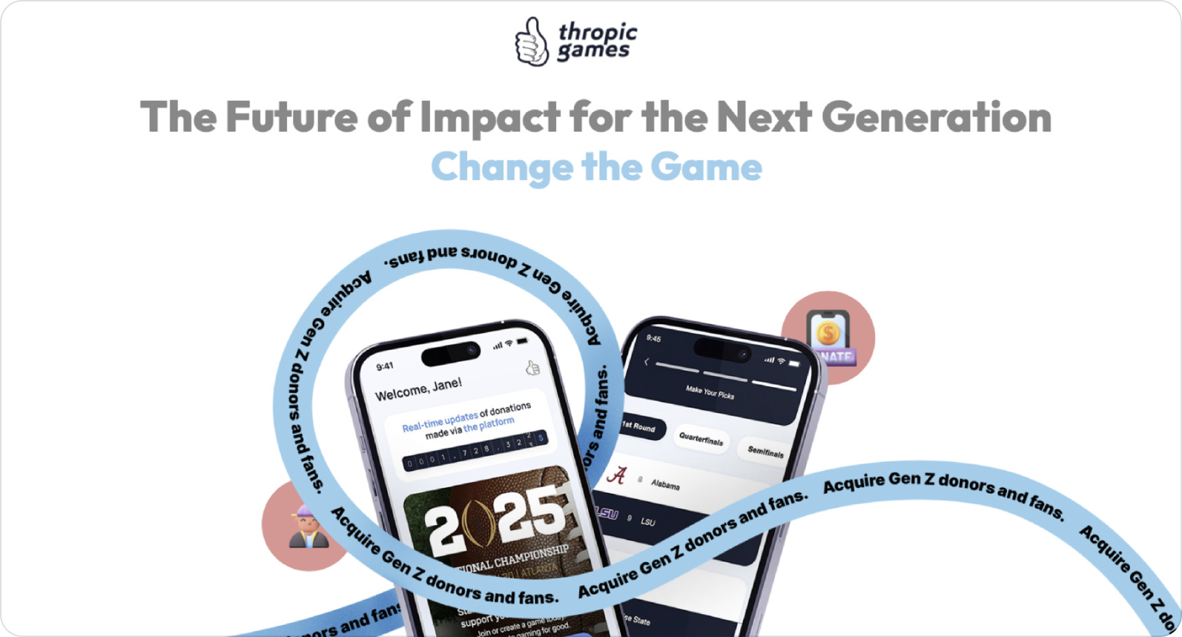
The team needed one deck that explained the company the same way every time. I rebuilt it so the mission led and the numbers backed it up, instead of the other way around.
Takeaways
What I learned that summer.
Working at a startup means you are never just making one thing. I also learned about hard and fast deadlines. Handing work off before it feels finished is difficult, but there is never enough time to get it perfect, and waiting for perfection only delays delivery. What actually mattered wasn’t any single asset — it was creating the standard for the designers who came after me.
Paid Social
One voice, four channels
Static ads for Instagram, LinkedIn, Facebook, and email. I built them so they didn’t have to be redrawn for each platform, just recropped. Same system, different sizes.